


PRIMARY ROLE:
Design Lead
TIME FRAME:
2 Months (Jan to Feb 2025)
CLIENT:
State Data Protection Inspectorate of Lithuania
SUMMARY
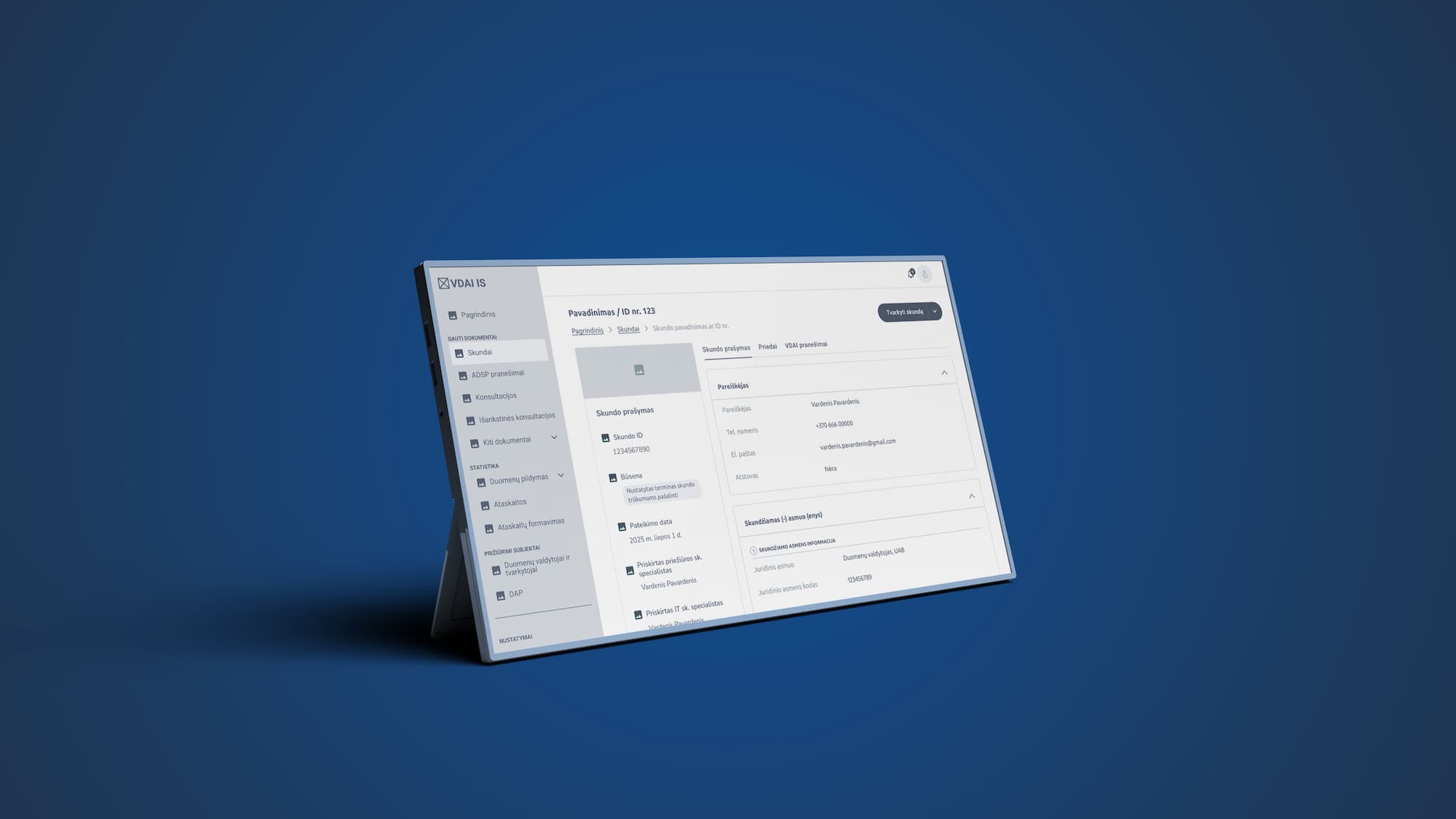
In early 2025, I was brought in as the lead UX designer for the State Data Protection Inspectorate's of Lithuania ambitious project to digitise personal data protection processes. The Inspectorate had a strict two-month timeline for the design work. My task was to define and validate the structure of a new personal data management system on a national scale – quickly creating a clear blueprint before development could begin.
With such high stakes, I focused on making mid fidelity wireframes and information architecture crystal clear. As industry experts note, moving from paper to digital is risky, and UX has the power to make or break a digitisation effort, so our design foundation had to be solid from day one.
Optimised processes
+10
Major features
+16
Wireframes
+400
CHALLENGE
Working on a national personal data protection system under a tight deadline was intense. I had to analyse dozens of complex legal workflows (from data breach cases to compliance audits) into a single cohesive system, all while picking only the highest-priority features. Key challenges included:
Time pressure: We had only two months to outline the entire system, leaving no time for trial and error.
Scope and prioritisation: With dozens of procedures to cover, I prioritized core functionality (e.g. request intake, case tracking, reporting) and tabled lower-priority features for later.
Clarity over aesthetics: We deliberately worked in low/mid fidelity wireframes to focus on solving problems, not on visual polish. This allowed us to iterate rapidly: low-fi prototypes allow us to quickly and inexpensively test ideas and avoid attachment, so we could discard bad ideas early.
By prioritising core processes and staying focused on solving problems (not pixels), we kept the project moving forward despite the constraints. To tackle these challenges, I set up a highly iterative, collaborative design process with the Inspectorate’s team.

WEEKLY WORKSHOPS AND RAPID WIREFRAMING
I facilitated weekly cross-disciplinary workshops with internal stakeholders (data officers, legal experts, IT staff) to break down each workflow, define system roles and review the wireframes. After each workshop, I turned the team’s input into rough wireframes and an information architecture map, focusing purely on structure and function. Using mid-fidelity sketches let us test ideas quickly – we could get rapid feedback on our core layout without getting bogged down in design details.
VALIDATING INFORMATION ARCHITECTURE AND KEY FEATURES
Once a month, I ran targeted usability sessions to validate the system’s information architecture and test the most critical features we had designed so far. Internal users clicked through interactive prototypes to check if terminology, navigation, and flow matched their expectations. To deepen the insights, I also analyzed heatmaps and clickmaps generated during testing—these visual data points helped pinpoint areas of confusion, missed expectations, and unused interface elements. Together, the qualitative and behavioral insights guided key adjustments to structure and flow.
This steady rhythm—weekly co-creation, monthly testing—created a sustainable, feedback-driven process. Staying in mid fidelity meant we could adjust and refine designs without delay when something wasn’t working. It allowed us to progress quickly while keeping users at the center of each decision.

RISK SEGMENTATION OF DATA CONTROLLERS
One of the most impactful solutions during the design phase was introducing risk segmentation of data controllers. Instead of treating all data controllers the same, we designed a flexible system that grouped them into risk-based segments based on criteria such as volume of personal data processed, prior violations, or organisational type.
This segmentation allowed the Inspectorate to:
Prioritise audits more intelligently, focusing first on high-risk entities
Streamline workflows, assigning automated audit triggers or alerts to specific segments
Visualise oversight priorities, using dashboards that highlighted risk distribution across sectors
By embedding this logic directly into the system structure early on, we made complex auditing workflows smarter and significantly easier to manage. It also aligned with the team’s long-term goal: a system that wasn’t just digitised, but strategically optimised.
IMPACT
After two months of intensive design work, we delivered a full blueprint for the new system. We mapped out all major modules and workflows, validated navigation, and handed off a working prototype skeleton ready for development. Key results included:
System structure established: We mapped out all core modules and workflows into a coherent architecture. Every major section (request intake, case management, reporting, etc.) was outlined and confirmed.
Navigation tested and validated: Usability tests showed that internal users consistently found what they needed where they expected, validating the information hierarchy we designed.
Prototype skeleton delivered: The final deliverable was a clickable low-fidelity prototype covering all key screens. This “skeleton” gave developers a clear blueprint to build from.
Team feedback: The team felt relief and excitement knowing they had a solid foundation instead of guesswork.
These outcomes reflected the strength of our UX-driven approach: a clear, tested system ready for the next phase of development.
REFLECTIONS: WHY IT WORKED
Looking back, several factors made this approach successful:
Frequent collaboration: Involving stakeholders at every step ensured we captured the right requirements early. The team felt ownership of the solution as they saw their input shaping the design.
Focus on essentials: Prioritising user needs and core functionality (instead of visual polish) kept us efficient and on target. We tackled the hardest problems first and prevented scope creep.
Iterative feedback: The quick workshop→prototype→test loops allowed us to catch issues early.
Outcome-oriented mindset: The team was energised by seeing tangible progress each week. Delivering a clear, tested system outline under tight constraints felt deeply fulfilling. It reminded me why I became a UX designer: I used human-centered design to turn bureaucratic complexity into clarity, and the team’s gratitude confirmed that our approach truly made a difference.
This case proved that, even under intense time pressure, a clear focus on collaboration, clarity, and user needs can drive a successful outcome. The positive feedback and smooth handoff underscored that the foundation we built was exactly what the system users required.